
Project Overview
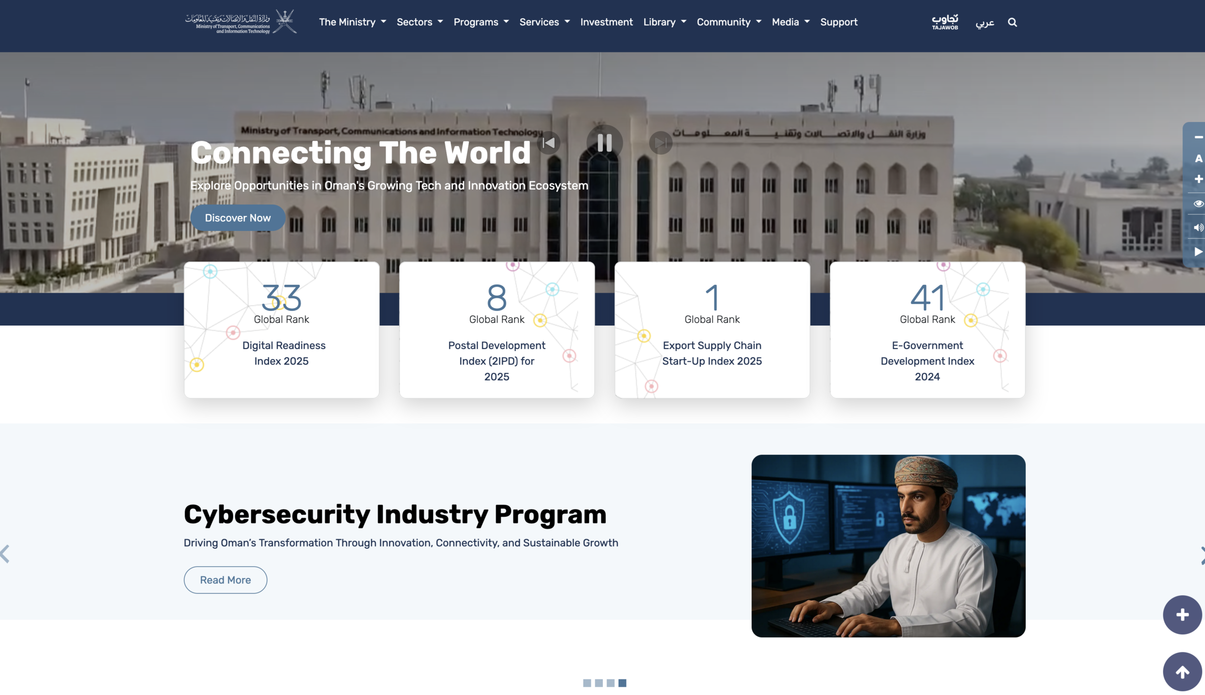
The Ministry of Transport, Communications and Information Technology — MTCIT — oversees a broad ecosystem spanning transportation, communications, digital infrastructure, cybersecurity, artificial intelligence, digital transformation, investment, public services, programs, research, community initiatives, and government information.
The challenge was therefore much larger than redesigning a government website.
The product needed to help very different audiences navigate a large amount of information while supporting multiple sectors, services, programs, platforms, reports, policies, investments, media content, community initiatives, and support journeys within one coherent digital experience.
As a Senior Product Designer, I worked across the redesign process with a strong focus on information architecture, audience needs, navigation, content structure, reusable page patterns, interaction design, accessibility, responsive UI, and system-level consistency.
The objective was to transform a fragmented content-heavy government website into a more structured, discoverable, and scalable digital platform.
My Role
Senior Product Designer
My work focused on translating a complex ministry ecosystem into a usable and scalable digital structure.
My responsibilities included contributing to:
- UX strategy
- Audience and persona analysis
- User journey definition
- Competitive and government website benchmarking
- Information architecture
- Sitemap development
- Content organization
- Navigation design
- User flows
- Low-fidelity wireframes
- Interactive prototypes
- High-fidelity UI design
- Responsive design
- Accessibility considerations
- Reusable page templates
- Component-based design
- Stakeholder reviews and design iterations
The project itself was structured around a progression from strategy and architecture into wireframes, prototypes, final UI, and reusable component patterns.
The Challenge
A Government Website With Multiple Products Inside It
MTCIT is responsible for several major domains, including:
- Transport
- Logistics
- Maritime
- Ports
- Roads and land transport
- Digital infrastructure
- Digital transformation
- Cybersecurity
- Artificial intelligence
- Digital skills
- Space
- Governance
At the same time, the website needed to serve as an access point for:
- public information
- services
- programs
- projects
- investment opportunities
- reports
- legislation
- policies
- publications
- training
- surveys
- media
- events
- open data
- external platforms
- complaints
- support
The ministry’s documented objectives included public information, national programs, investment, AI, cybersecurity, skills, training, and academia.
This created a fundamental product-design problem:
How do you make a very large government ecosystem understandable without exposing users to its internal complexity?
Discovery and Strategy
Understanding the Digital Ecosystem Before Designing Screens
Before moving into detailed UI design, the project included strategic analysis of:
- ministry goals
- target audiences
- content types
- website features
- user needs
- government benchmarks
- information structure
- required functions
The goal was to create a website that could remain maintainable and scalable as the ministry continued adding new services, projects, initiatives, policies, and content.
The project strategy identified the need for a unified, updated, sustainable, and easy-to-use ministry website rather than a collection of disconnected departmental pages.
Benchmarking Government Digital Experiences
To understand common patterns and opportunities in government websites, the project benchmarked 19 different government websites.
The analysis identified several recurring characteristics of effective public-sector experiences:
- intuitive navigation
- effective search
- modern visual design
- organized content
- user engagement tools
- comprehensive footer navigation
- responsive layouts
- accessibility considerations
The research also highlighted features such as multilingual support, mega menus, service blocks, accessibility controls, media centers, mobile compatibility, eParticipation, interactive elements, and voice-related functionality.
The purpose of benchmarking was not to copy other government websites.
It helped us understand common expectations for large public-sector platforms and identify which patterns could help users navigate MTCIT’s unusually broad information ecosystem.
Understanding Multiple Audience Groups
One of the most important challenges was that there was no single “MTCIT user.”
The project defined a broad audience model containing 17 major user groups:
- Companies
- Investors
- Beneficiaries
- Citizens
- Government Entities
- IT Professionals
- Students
- Academic Entities
- Community Members
- Crisis Responders
- Event Users
- Exhibitors
- International Entities
- Startup Companies
- Training Institutes
- Writers
- other specialized stakeholders represented across the broader research framework
The persona and user-journey documentation was created specifically to prevent a “one solution fits all” approach and to connect design decisions with the needs, behaviors, and goals of different user groups.
From Personas to Navigation
The personas were useful because their needs mapped directly to different parts of the website.
For example:
Companies
A company might need:
- digital transformation initiatives
- licensing information
- tenders
- compliance guidelines
- government partnerships
- reports
Its journey could span Sectors → Procurement → Media → Support.
Investors
Investors needed:
- investment opportunities
- strategic plans
- economic information
- sector growth data
- regulation
- reports
- open data
Their journey could include:
Investment → Strategic Plans → Reports & Studies → Open Data
rather than a single destination page.
Citizens
Citizens primarily needed:
- public services
- transport information
- government updates
- legislation
- open data
- surveys
- support
The experience therefore needed clear paths from Services into sector-specific information, while still allowing access to Library and Community content.
Government Entities
Government users required a very different experience.
They needed access to:
- cross-government programs
- cybersecurity information
- policies
- guidelines
- projects
- digital transformation initiatives
Their journeys connected areas such as Sectors, Library, Programs, and Projects.
IT Professionals
IT professionals were more likely to need:
- technical documentation
- standards
- policies
- digital transformation initiatives
- training
- guidelines
For them, Sectors and Library became important entry points.
Students and Academic Users
Students needed training, competitions, events, and learning resources.
Academic entities were more focused on publications, reports, research collaboration, and government-funded initiatives.
Although both audiences were interested in education and technology, their journeys were different.
Key Product Insight
One of the major insights from the project was:
The same content can be relevant to multiple audiences for completely different reasons.
A cybersecurity report might be relevant to:
- a government entity for compliance
- an IT professional for technical guidance
- an academic researcher for research
- an international company for investment due diligence
That meant the architecture could not rely only on individual departments or static pages.
The system needed shared content types, multiple discovery paths, filters, sector relationships, and reusable components.
Rethinking the Information Architecture
The redesign established several top-level content domains:
The Ministry
Organizational information, vision, mission, strategic plans, rankings, collaboration, and institutional information.
Sectors
The major domains supervised by MTCIT.
Programs
Programs across information technology and transportation domains.
Services
Digital and transport-related public services.
Investment
Investment opportunities and related information.
Library
Reports, studies, policies, guidelines, legislation, documentation, articles, and publications.
Community
Training, surveys, open data, and public engagement.
Media
News, announcements, programs, initiatives, events, and competitions.
Support
Complaints, inquiries, appointments, incident reporting, emergency support, and technical assistance.
This structure became the backbone of the redesigned experience.
Designing a Content System, Not Just Pages
One of the strongest design decisions was treating the site as a content system.
The project identified multiple reusable content types, including:
- Articles
- Publications
- Reports
- Studies
- Guidelines
- Documentation
- Legislation
- Policies
- Programs
- Projects
- Services
- Training
- Surveys
- News
- Events
- Competitions
- Investment opportunities
The content model also supported sector-specific attributes and relationships, allowing the same content types to appear in different contexts.
This allowed us to move away from designing every page independently.
Creating Reusable Sector Experiences
A sector such as:
Space
or
Logistics
could contain many different kinds of information:
- introduction
- vision and mission
- projects
- stakeholders
- training
- services
- guidelines
- reports
- studies
- legislation
- policies
- articles
- publications
- FAQs
- contact information
Instead of creating completely different page structures for every sector, we designed reusable patterns that could accommodate different content while maintaining consistency.
This was important for long-term scalability.
Programs Architecture
Programs were also divided into major domains.
For Information Technology, categories included:
- Digital Infrastructure
- Cybersecurity
- Artificial Intelligence
- Digital Transformation
- Digital Skills
- Space
For Transportation, categories included:
- Logistics
- Maritime
- Ports
- Governance
- Roads Transport
- Land Transport
The goal was to help users understand where a program belongs while still allowing them to browse across the ministry’s broader portfolio.
Designing the Artificial Intelligence Program Experience
The AI program page illustrates the modular structure particularly well.
The page could combine:
- program overview
- vision and mission
- pillars
- projects
- services
- events
- competitions
- FAQs
- contact information
This allowed one program page to act as a mini ecosystem while still using common patterns from the broader site.
Services
Services needed their own discovery model because users often came to the website with a task rather than an interest in ministry structure.
The service architecture separated major domains such as:
Information Technology
- Digital Infrastructure
- Digital Transformation
- Cybersecurity
- Digital Skills
- Artificial Intelligence
- Space
Transport
- Logistics
- Maritime
- Ports
- Governance
- Roads Transport
- Land Transport
The interface also explored filtering and listing patterns to help users narrow large sets of services.
The goal was to make service discovery possible without requiring users to understand the ministry’s internal organization.
Library
The ministry had a large knowledge ecosystem.
The Library needed to support content including:
- Articles
- Publications
- Reports
- Studies
- Guidelines
- Documentation
- Legislations
- Policies
Instead of presenting these as isolated pages, the redesign treated them as a structured resource library.
The interface supported:
- content-category switching
- searchable resources
- count-based category visibility
- card-based listings
- metadata
- downloads
- reusable content templates
This created a clearer distinction between transactional services and research-oriented content.
Community
The Community section addressed participation and knowledge sharing.
Major content types included:
- Open Data
- Surveys
- Training
- Polls
This allowed users to do more than consume information.
They could also participate in surveys, discover training, explore public data, and engage with ministry initiatives.
This was especially relevant for community members, students, researchers, and professionals.
Media
The Media experience brought together:
- Programs, Projects & Initiatives
- News & Announcements
- Events & Competitions
Rather than creating separate navigation silos, related communication content could be surfaced within one understandable domain.
Support as a Product Capability
Support was treated as more than a “Contact Us” page.
The design explored multiple assistance paths, including:
- Road Accident Assistance
- Maritime Emergency Help
- Service Hall Support
- IT Support
- Complaints
- Appointment booking
- Incident reporting
- IT assistance
- FAQs
- specialized tools
This was an important design decision.
A government website should help users recover when they cannot complete a task independently.
Search and Discovery
Because the site contains a large amount of information, search was considered a central capability.
The benchmarking phase identified prominent search and filtering as important features for large government websites where users may not know where information is located.
Search experiences were therefore considered across:
- Library
- Community
- Program pages
- sector pages
- media
- services
The broader project requirements even included concepts such as intelligent or AI-assisted search as potential functionality.
Wireframing the System
Once the information architecture was defined, the design moved into low-fidelity wireframes.
The purpose of the wireframes was to test:
- content priority
- page hierarchy
- component placement
- navigation patterns
- reusable structures
- relationships between different content types
Key page types included:
- homepage
- sector pages
- service listings
- library
- community
- support
- program pages
- platform listings
- content detail pages
The wireframe stage deliberately focused on structure before visual styling. The project documentation describes this phase as defining page layout, component distribution, and content placement before focusing on typography, colors, or visual details.
Designing Templates Instead of Screens
One of the most important decisions during wireframing was to create reusable templates.
For example, sector pages followed a repeatable structure that could adapt to different content.
A Space page and Logistics page might contain very different information, but users should not need to relearn the interface every time they move between sectors.
This system-level approach helped address one of the central challenges:
How can a large organization continue adding content without creating a completely new UX pattern every time?
From Wireframes to Interactive Prototypes
The project explored multiple design directions before moving into final UI.
Prototype concepts were reviewed with stakeholders to evaluate:
- layout
- navigation
- branding
- interactions
- hierarchy
- visual direction
The documented process included creating multiple prototypes, presenting them to stakeholders, gathering feedback, selecting a direction, refining it, and obtaining approval before proceeding into high-fidelity design.
Building a Reusable Design System
The UI system followed principles from Atomic Design.
Rather than designing every interface independently, the system was structured into reusable levels:
Atoms
- buttons
- icons
- inputs
- typography
- basic UI elements
Molecules
- search bars
- navigation items
- form groups
- content controls
Organisms
- headers
- footers
- content cards
- navigation groups
- section blocks
Templates
- sector pages
- service pages
- library pages
- program pages
- community pages
- media pages
The purpose was to build components that could be reused as the website continued to grow.
Visual Design
The final visual direction aimed to balance two competing needs:
Government authority and trust
The interface needed to feel credible, stable, and aligned with MTCIT’s institutional identity.
Modern digital experience
The ministry also represents technology, innovation, AI, digital transformation, and future infrastructure.
The final UI therefore used:
- a structured blue visual system
- generous white space
- modular cards
- sector-specific icons
- clear typography
- consistent content blocks
- simple filters
- predictable navigation
- technology-inspired graphical elements
The visual system supported information density without making every page feel visually heavy.
Accessibility
Accessibility was treated as part of the overall system rather than a separate feature.
Design considerations included:
- readable typography
- clear hierarchy
- color contrast
- predictable navigation
- accessible controls
- responsive layouts
- structured content
- support-oriented interactions
The design documentation specifically required accessibility best practices, including WCAG-related considerations such as contrast, font size, and alternative text.
Responsive Design
The product needed to work across:
- desktop
- tablet
- mobile
The design system therefore emphasized reusable layouts and components rather than fixed desktop compositions.
Responsiveness was explicitly included as part of the high-fidelity design process and final deliverables.
Stakeholder Collaboration
A government website of this scale involves many internal stakeholders and departments.
The design process therefore included repeated cycles of:
Design → Review → Feedback → Refine
Wireframes and prototypes were shared with stakeholders, revised, and progressively refined before final UI preparation.
This required balancing:
- user needs
- ministry goals
- departmental requirements
- technical constraints
- branding
- content complexity
- accessibility
- scalability
The documented process explicitly included stakeholder review and iterative refinement before moving between design phases.
The Design Outcome
The project did not include reliable post-launch quantitative product metrics that I can attribute directly to my design work.
For that reason, I do not present unsupported claims such as percentage improvements in conversion, task success, engagement, or usability.
The tangible outcome of the design work was a more structured digital foundation for MTCIT, including:
- A consolidated information architecture
- Audience-aware user journeys
- Structured content domains
- Sector and program architecture
- Service discovery patterns
- Dedicated Library and Community experiences
- Support-center architecture
- Reusable sector templates
- Reusable program templates
- Search and filtering patterns
- Responsive layouts
- Accessibility considerations
- Interactive prototypes
- High-fidelity UI
- Component-based design direction
- A reusable interface system capable of supporting many different content types
What Made This Project Challenging
The hardest part was not designing the homepage.
It was designing a system capable of supporting the ministry’s complexity without making users experience that complexity directly.
The final product needed to simultaneously support:
Citizens + Businesses + Investors + Government Entities + Professionals + Researchers + Students + Community Members + International Stakeholders
while also organizing:
Transport + Technology + AI + Cybersecurity + Space + Digital Transformation + Services + Programs + Investment + Research + Policies + Media + Community + Support
That required treating information architecture as a core product-design problem.
What I Learned
1. Information Architecture Can Be the Product
On complex platforms, the main UX problem is not always the interface.
It can be the relationships between information.
A visually attractive interface cannot compensate for a confusing content model.
2. Personas Become Valuable When They Affect Architecture
Creating personas alone does not create a user-centered product.
Their value comes from using them to influence:
- navigation
- entry points
- content priorities
- journeys
- service discovery
The MTCIT audience framework connected different users to different parts of the ecosystem rather than treating every persona as a presentation artifact.
3. Large Platforms Need Reusable Patterns
When an organization manages hundreds of pieces of content across many departments, screen-by-screen design does not scale.
Templates, components, shared content models, and predictable page patterns become essential.
4. One Piece of Content Can Serve Multiple Journeys
A report, project, or program may be relevant to several audiences.
Designing only around hierarchical page ownership can hide useful information.
Content relationships and multiple discovery paths are often more valuable.
5. Public-Sector UX Requires Balancing Many Stakeholders
A government website is shaped by:
- citizens
- businesses
- policy teams
- ministries
- technical teams
- communications departments
- legal requirements
- accessibility needs
- content managers
The designer’s role is often to create clarity across these competing requirements.
6. Accessibility and Scalability Are Connected
Clear hierarchy, consistent templates, readable content, and predictable navigation help users with disabilities, but they also help everyone else.
The same principles that improve accessibility often make a large product easier to maintain and understand.
Final Reflection
The MTCIT website redesign was not primarily a visual-design challenge.
It was a systems-design challenge.
The project required turning a large government ecosystem into a digital structure that could support many audiences, sectors, services, programs, and content types without becoming impossible to navigate or maintain.
My work as a Senior Product Designer centered on helping transform that complexity into:
clearer architecture, reusable patterns, structured journeys, and a scalable digital experience.
The project strengthened one of the principles I now bring into complex product work:
Good design does not remove complexity from the organization. It prevents that complexity from becoming the user’s problem.
Project Details
Product: MTCIT — Ministry of Transport, Communications and Information Technology Website
Industry: Government / GovTech / Digital Transformation
Role: Senior Product Designer
Location: Oman
Focus: Information Architecture, UX Strategy, Complex Content Systems, User Journeys, Wireframing, Prototyping, UI Design, Accessibility, Responsive Design, Design Systems
Core Areas
GovTech · Product Design · Information Architecture · Complex Systems · UX Strategy · Multi-Audience UX · Content Architecture · Design Systems · Accessibility · Responsive Design · Digital Transformation