
Jibe by Zacoustic
Project Overview
Jibe is a Customer Experience management platform developed by Zacoustic, a US-based SaaS company founded in Austin, Texas.
Zacoustic created Jibe around a distinctive idea: instead of relying only on direct customer surveys, contact-center agents predict how customers would respond after an interaction. Actual customer survey responses are then used to audit and calibrate those predictions.
This approach helps organizations generate a much broader stream of customer-perception data across their contact-center operations. Zacoustic describes this as making the customer the single point of truth while enabling agents to act as the voice of the customer. (Jibe Platform)
My Role: Senior Product Designer / Senior UX UI Designer
Company: Zacoustic Inc.
Location: Remote, United States
Industry: Customer Experience Management, B2B SaaS, Analytics
Product: Jibe
Project Period: 2021 to 2022
Understanding the Product
Traditional customer surveys have a major limitation: only a small percentage of customers respond.
Zacoustic states that direct customer-survey response rates are typically around 10 percent. Jibe addresses this problem by asking agents to predict customer survey responses after interactions and using actual customer responses to evaluate prediction accuracy. (Jibe Platform)
This creates a richer stream of customer-experience information that can support:
- Customer Experience analytics
- Quality Assurance
- Coaching
- Agent development
- Operational performance monitoring
- AI and predictive systems
Zacoustic positions the Jibe Data Stream as a source of actionable customer-perception data that can integrate with analytics, QA, coaching, and AI platforms. (Jibe Platform)
The Design Challenge
Jibe was not a simple dashboard.
The platform served different user groups across a contact-center organization, including frontline agents, supervisors, managers, CX professionals, and leadership.
Each role needed different information, levels of detail, and actions.
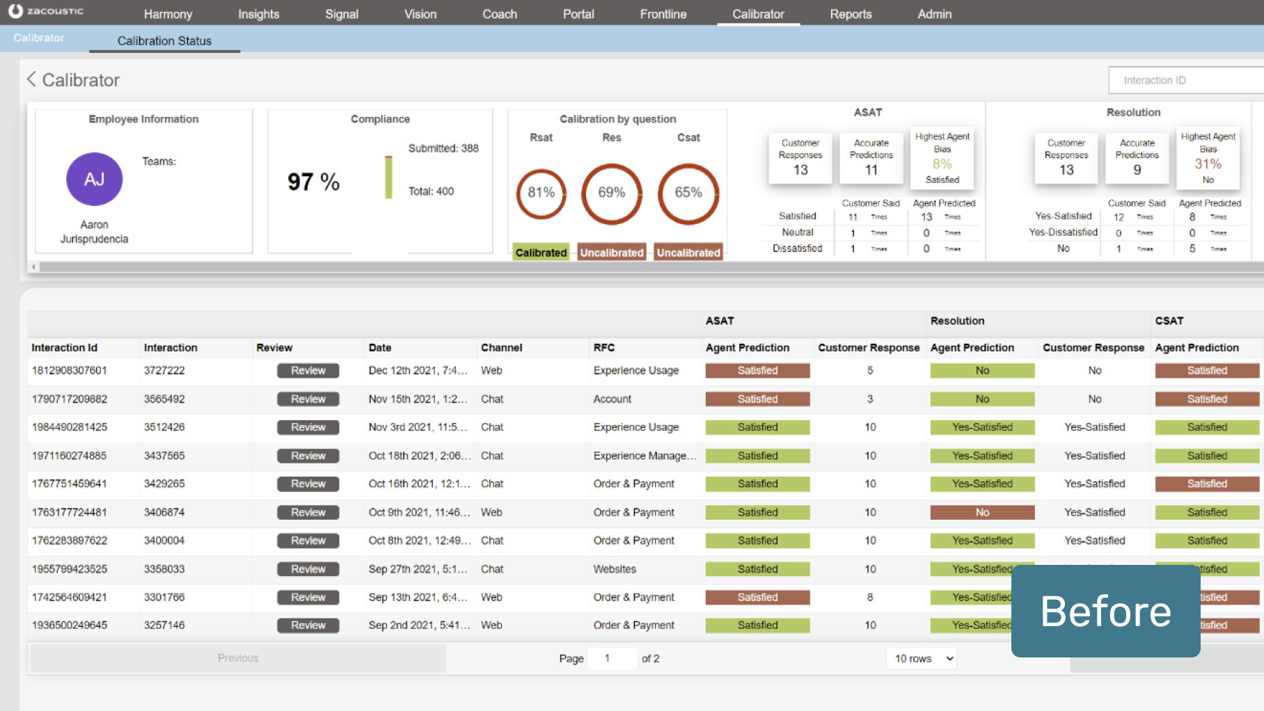
The existing experience contained several usability challenges:
- complex navigation
- dense information
- unclear information hierarchy
- heavy analytics presentation
- inconsistent terminology and icons
- difficulty locating key reports and features
- limited guidance for users unfamiliar with the platform
These issues made it harder for users to quickly understand what was happening and what action they should take.
My role was to help simplify the product without removing the depth required by enterprise users.
My Responsibilities
My work focused on the redesign of the Jibe platform and its role-based experiences.
I contributed to:
- UX research
- information architecture
- role-based dashboard structure
- data hierarchy
- KPI presentation
- interaction design
- workflow simplification
- usability testing
- prototyping
- design-system consistency
- stakeholder collaboration
- iterative refinement based on usability findings
The core challenge was turning a complex data-heavy SaaS product into a clearer, more navigable experience for users with very different responsibilities.
Research and Discovery
The redesign began with understanding where users were struggling.
The existing case study included several research activities:
Heuristic Evaluation
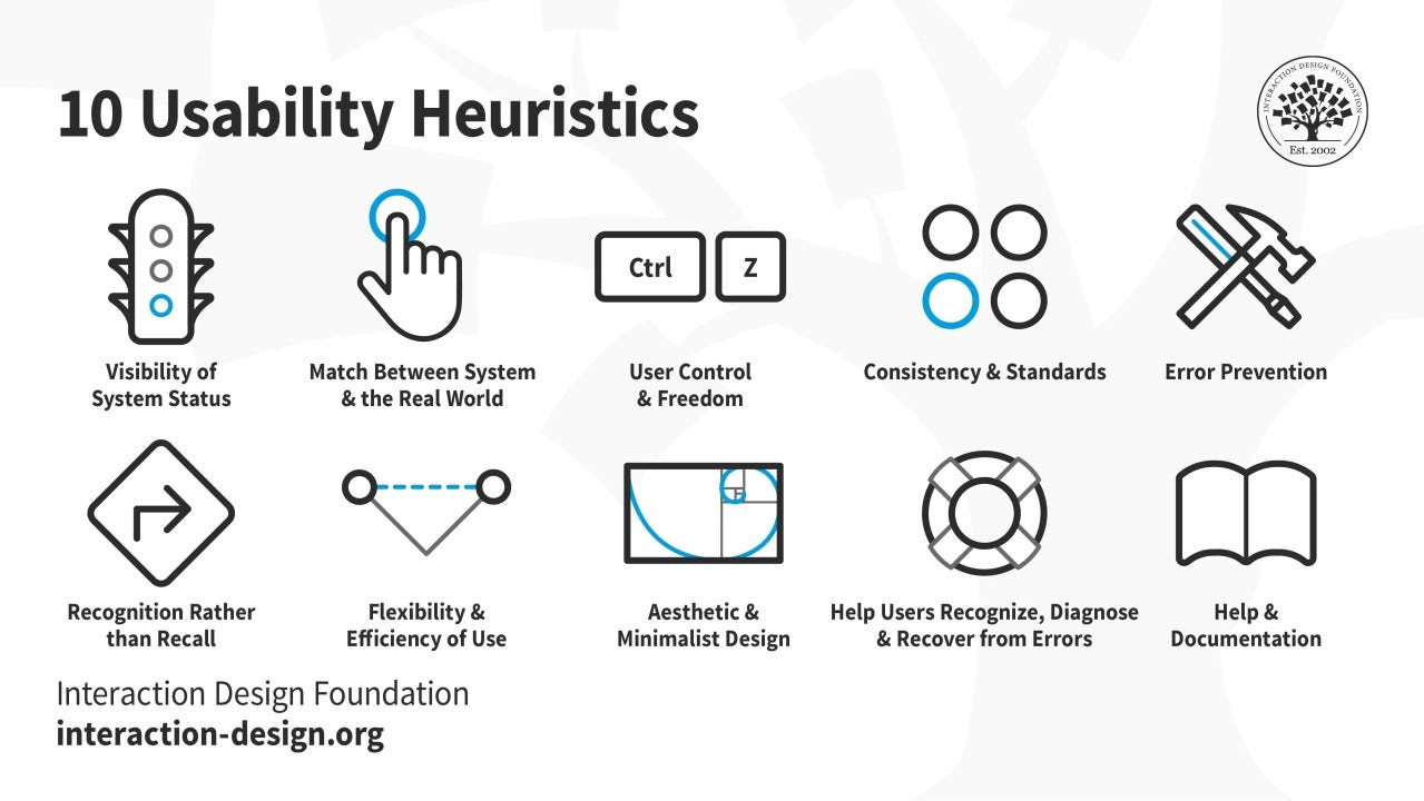
We evaluated the interface against established usability principles, including:
- system feedback
- consistency
- error prevention
- recognition over recall
- clarity of navigation
- help and documentation
Competitive Analysis
We compared Jibe with other CX and analytics platforms, including products such as:
- Medallia
- Qualtrics
The goal was not to copy competitor patterns, but to understand common expectations for enterprise CX products and identify where Jibe could simplify complex workflows.
User Interviews
The existing research included interviews with 15 CX managers and agents.
The conversations focused on:
- navigation difficulties
- reporting needs
- dashboard usage
- feature priorities
- terminology
- workflow pain points
User Survey
More than 50 users were surveyed about platform pain points and feature priorities.
Baseline Usability Findings
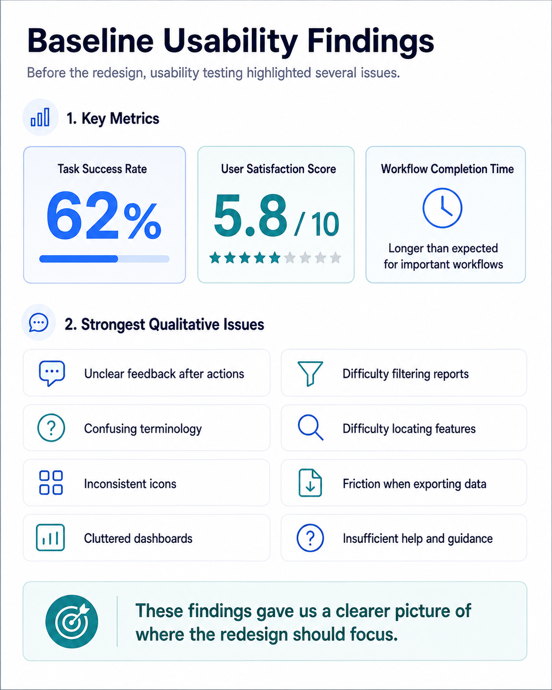
Before the redesign, usability testing highlighted several issues.
The existing project documentation recorded:
- Task Success Rate: 62 percent
- User Satisfaction Score: 5.8 out of 10
- Users taking longer than expected to complete important workflows
The strongest qualitative issues were:
- unclear feedback after actions
- confusing terminology
- inconsistent icons
- difficulty filtering reports
- difficulty locating features
- friction when exporting data
- cluttered dashboards
- insufficient help and guidance
These findings gave us a clearer picture of where the redesign should focus.
The Core UX Problem
The biggest design problem was not the amount of data itself.
The problem was that the system did not always communicate:
What matters to me?
What should I look at first?
What action should I take next?
Different users required different answers.
For example:
An agent may need immediate feedback about performance.
A supervisor may need to identify coaching opportunities.
A CX manager may need to understand patterns across teams.
Leadership may need high-level trends and business impact.
This led to a key design principle:
The dashboard should be organized around user decisions, not around the underlying data structure.
Role-Based Information Architecture
One of the major redesign areas was information architecture.
Rather than exposing the same information equally to every user, the experience was structured around role-specific priorities.
The redesign considered:
- which KPIs each role needed
- how frequently they used each feature
- which actions should be immediately available
- what level of detail should be visible by default
- what information could be progressively disclosed
This reduced unnecessary cognitive load and created clearer paths through the platform.
Dashboard Redesign
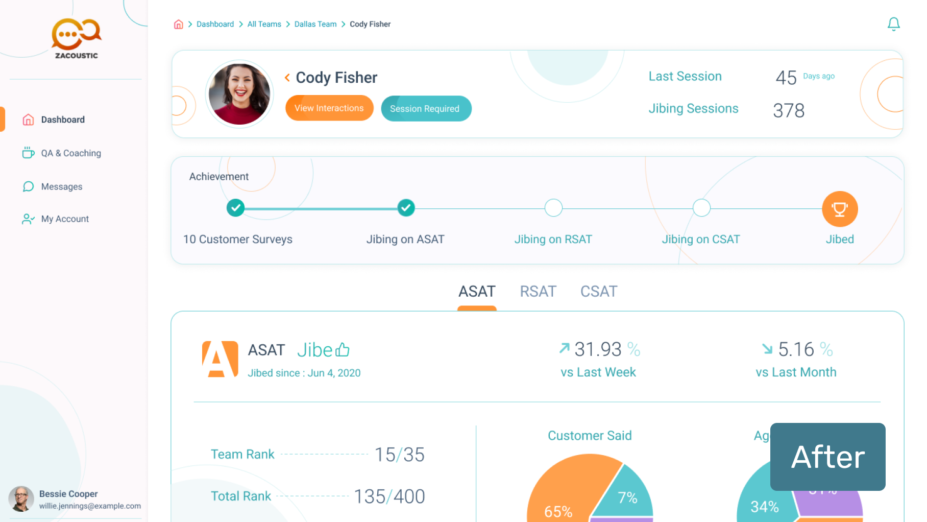
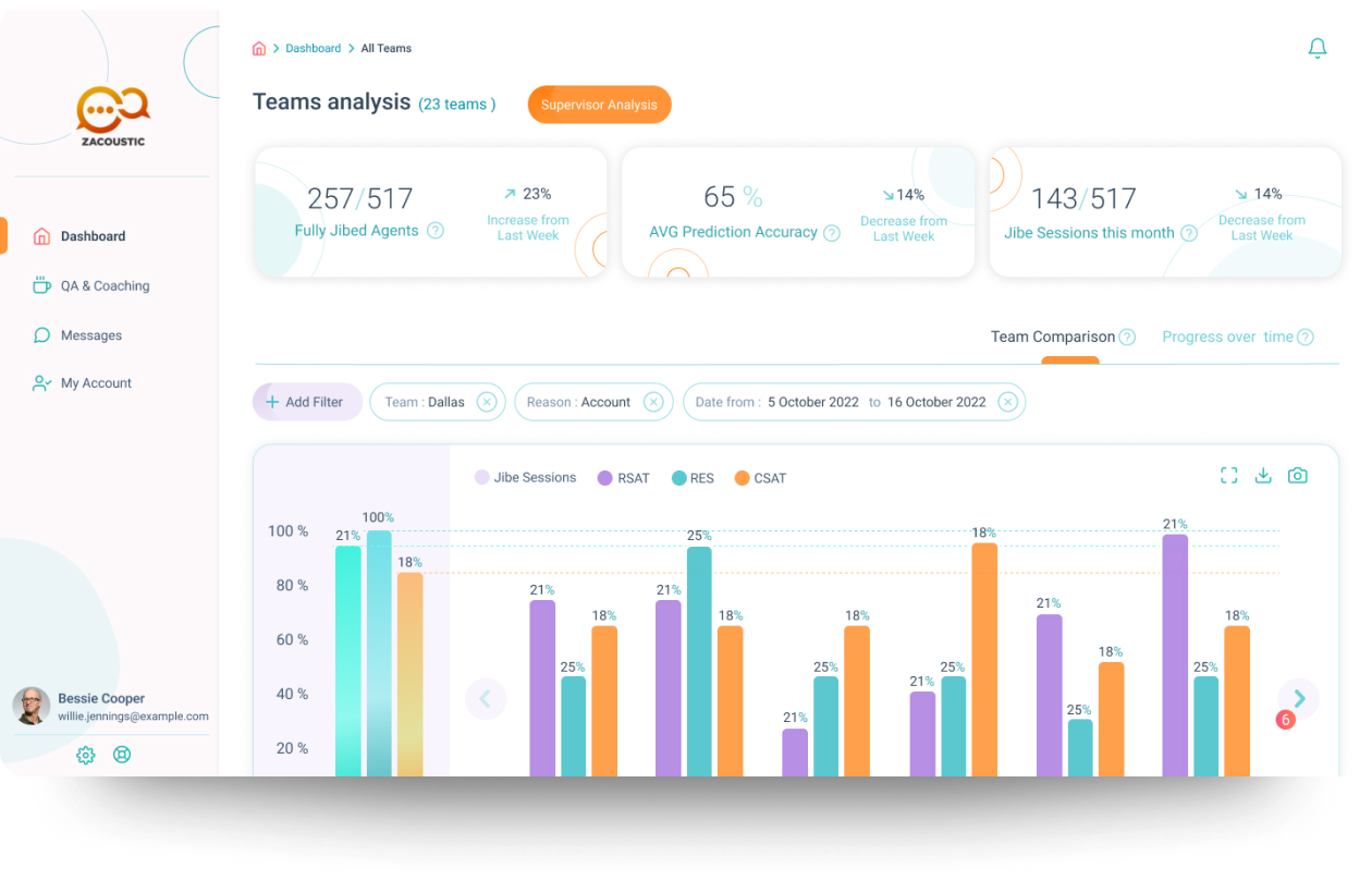
The dashboard redesign focused on improving information hierarchy.
Instead of presenting every metric with equal visual weight, information was organized according to priority.
The design introduced clearer separation between:
- high-level KPIs
- performance trends
- actionable alerts
- reports
- detailed analysis
The objective was to make the first screen answer:
What requires my attention now?
before asking the user to explore deeper analytics.
KPI and Data Visualization
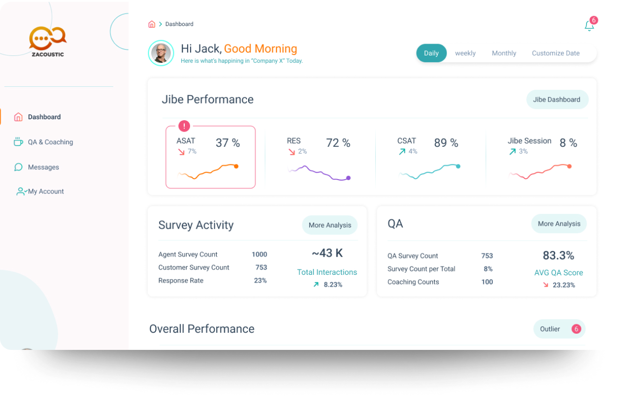
Jibe works with operational and customer-experience metrics such as:
- Customer Satisfaction
- First Contact Resolution
- Average Handle Time
- Quality Assurance metrics
- customer survey predictions
- performance trends
The redesign focused on making these metrics easier to scan and compare.
This included:
- stronger visual hierarchy
- clearer chart structure
- consistent KPI treatment
- simplified labels
- customizable filters
- easier access to detailed reports
The goal was not to reduce the amount of information available, but to improve how that information was prioritized and interpreted.
Simplifying Complex Workflows
Usability testing showed that users struggled with tasks such as:
- filtering reports
- finding specific functionality
- interpreting terminology
- exporting information
- understanding what happened after an action
We therefore focused on:
- clearer labels
- standardized interaction patterns
- more consistent icons
- visible feedback after actions
- shortcuts for common tasks
- improved contextual guidance
The redesign aimed to reduce the number of decisions users needed to make before reaching the information they needed.
Onboarding and Guidance
A complex enterprise platform cannot assume that every user already understands its terminology and structure.
The design therefore explored additional guidance mechanisms, including:
- contextual tooltips
- progressive onboarding
- help content
- FAQs
- learning resources
- contextual explanations
The objective was to reduce dependency on external training and help users understand the platform within the product itself.
Designing for Multiple Organizational Levels
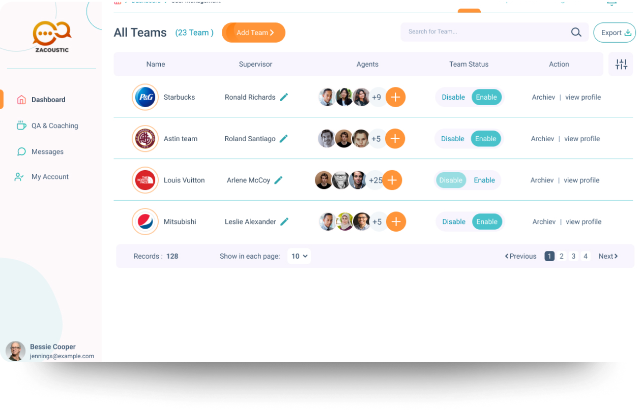
One of the most interesting aspects of Jibe is that customer-experience data can be used across an organization.
Zacoustic describes Jibe as supporting alignment from frontline agents through middle management to executives. CX professionals can use the platform to communicate customer trends across the organization, while frontline agents receive information that can help improve individual interactions. (Jibe Platform)
This created an important UX challenge:
How can one product support both operational detail and executive-level understanding?
The redesign approached this through role-based views and progressive levels of information.
Jibe’s Broader Business Model
The value of Jibe extends beyond a single dashboard.
Zacoustic positions the Jibe Data Stream as a layer that can enhance:
- Analytics
- Quality Assurance
- Coaching
- Artificial Intelligence
- Customer Experience systems
The Data Stream can integrate with existing technology stacks and provide additional customer-perception signals for operational and analytical systems. (Jibe Platform)
This meant the product needed to work as part of a broader enterprise ecosystem rather than as an isolated application.
Human Predictions and AI
One particularly interesting aspect of Jibe is the relationship between human predictions and AI.
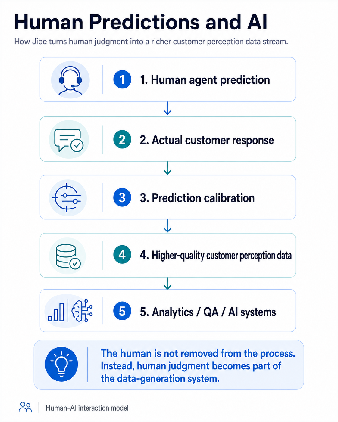
Zacoustic describes the Jibe Data Stream as a collection of human-generated predictions that can provide real-world feedback for AI systems operating in contact-center environments. (Jibe Platform)
From a product-design perspective, this creates a meaningful Human-AI interaction model:
Human agent prediction
↓
Actual customer response
↓
Prediction calibration
↓
Higher-quality customer perception data
↓
Analytics / QA / AI systems
The human is not removed from the process.
Instead, human judgment becomes part of the data-generation system.
Product Evidence from Zacoustic
It is important to separate my design contribution from the overall commercial impact of Jibe.
Zacoustic publishes several customer case studies that demonstrate how the product has been used in real organizations.
For example:
DIRECTV
Zacoustic reports that Jibe helped DIRECTV create a virtual near-complete customer-survey signal and use that information to identify operational best practices. Their case study reports improvements in Customer Satisfaction, Issue Resolution, and ROI. (Jibe Platform)
Essilor / Ray-Ban
Zacoustic reports:
- 10 percent Average Handle Time reduction
- 90 percent QA accuracy improvement
- approximately 450,000 annual survey predictions
These are product/client outcomes reported by Zacoustic and should not be interpreted as outcomes of my redesign work. (Jibe Platform)
Major League Baseball
Zacoustic reports that MLB used the Jibe Data Stream across its contact-center operations and received multiple Stevie Awards related to customer service, customer insight, and the use of predictive agent data. (Jibe Platform)
These examples demonstrate that the underlying product operates in high-volume, enterprise CX environments.
What I Would Not Claim
For transparency, I would not attribute Zacoustic’s published client outcomes directly to my design work.
Similarly, although my previous portfolio version included post-redesign usability improvement percentages, I no longer have sufficient documentation to confidently explain the measurement methodology behind all of those metrics.
For this case study, I therefore prefer to emphasize:
- verified research activities
- documented baseline usability findings
- design decisions
- product complexity
- role-based UX
- information architecture
- usability-driven iteration
rather than presenting unsupported impact claims.
My Most Important Contribution
My main contribution was helping transform a dense enterprise analytics experience into a more structured, role-aware product.
The redesign focused on one fundamental question:
How do we help each user see the right information, at the right level of detail, at the right moment?
That required more than visual redesign.
It required reconsidering:
- information architecture
- user roles
- data hierarchy
- workflows
- terminology
- interaction patterns
- dashboard composition
- contextual guidance
This project strengthened my experience designing complex B2B SaaS products where clarity is not achieved by removing complexity, but by structuring it.
Key Learning
Jibe reinforced an important product-design lesson for me:
Complex products do not necessarily need fewer capabilities. They need clearer relationships between information, users, and decisions.
Working on Jibe helped me develop stronger skills in:
- enterprise UX
- B2B SaaS
- dashboard design
- information architecture
- data-heavy interfaces
- usability testing
- role-based product design
- cross-functional remote collaboration
It also gave me experience designing a system where human predictions, operational metrics, and customer-perception data interact within a single product ecosystem.