Selected Group provides software solutions for restaurants, including order management, product delivery, and warehouse management. Their admin panel allows restaurant managers to configure these applications and generate reports on key business activities. However, many restaurant managers struggled with its complexity, leading to low adoption, increased support costs, and extended training requirements.
This project focused on redesigning the admin panel to create an intuitive, user-friendly experience, reducing friction, improving usability, and minimizing the need for ongoing support.
Restaurant managers using the Selected Group’s admin panel found it:
Difficult to navigate due to complex workflows.
Time-consuming, requiring multiple steps for simple tasks.
Confusing, leading to frequent errors and a need for extensive training.
Inefficient, increasing support costs and reducing operational effectiveness.
Non-technical Users: Most restaurant managers had little experience with software applications and required an intuitive interface.
Time Constraints: Managers were busy with daily operations and needed a fast, efficient system.
Support Costs: The company incurred high training and support costs due to usability issues.
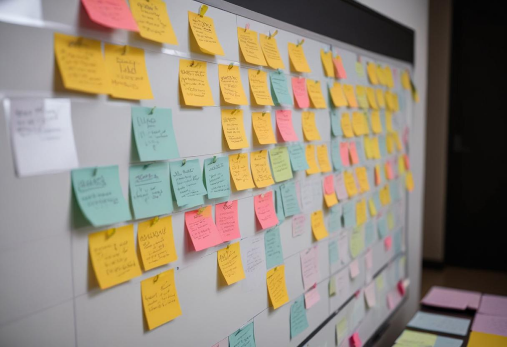
Since direct user research was constrained by time and budget, I leveraged secondary research and conducted interviews with the support team, who had direct interactions with users. I also analyzed user feedback collected via Hotjar and Google Forms.
Key Findings:
Restaurant managers struggled with complex workflows.
Order processing and reporting were particularly challenging.
Users preferred guided assistance within the system.
Unnecessary steps and information overload increased confusion.


Alex – The Restaurant Manager
Age: 32
Location: Brighton
Occupation: Multi-location restaurant manager
Needs: Efficiently track operations, generate reports, and manage staff with minimal software training.
Frustrations:
Reports did not meet business needs.
Tasks required multiple unnecessary steps.
Frequent training sessions were needed.

Emily – The Restaurant Employee
Age: 21
Location: London
Occupation: Order management staff
Needs: Quickly process orders and update system data with minimal errors.
Frustrations:
Order entry was slow and confusing.
Discount and price changes were cumbersome.
Too many steps caused mistakes in the process.
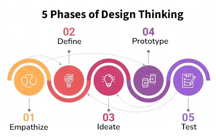
We adopted a User-Centered Design (UCD) framework with an iterative process:
Understanding Users: Analyzing past feedback and user interactions from support data.
Defining Problems: Synthesizing key pain points and areas of friction.
Ideating Solutions: Brainstorming ways to simplify the interface and workflows.
Prototyping: Creating wireframes, mockups, and interactive prototypes.
Testing & Iteration: Conducting usability tests, collecting feedback, and refining designs.
Key Design Decisions:
Simplified workflows by removing unnecessary steps and reducing clicks.
Integrated coach marks to guide users through processes in real time.
Implemented wizard-style interactions for complex tasks like report generation.
Reduced on-screen clutter by displaying only essential information per step.

I started with low-fidelity wireframes to quickly explore different design options. These wireframes:
Defined key features and workflows.
Provided a clear user journey from login to task completion.
Helped identify pain points before moving to high-fidelity designs.
User Flow Example: For Alex (the manager), we optimized the report generation process:
Select report type → 2. Choose filters → 3. Preview → 4. Download/Share
For Emily (the employee), we streamlined the order process:
Receive new order → 2. Confirm order details → 3. Assign to kitchen → 4. Track fulfillment

Tools Used:
Adobe XD – Wireframing & Prototyping
Zeplin – Design Handoff
Miro – User Flow Mapping
Adobe Photoshop – UI Elements
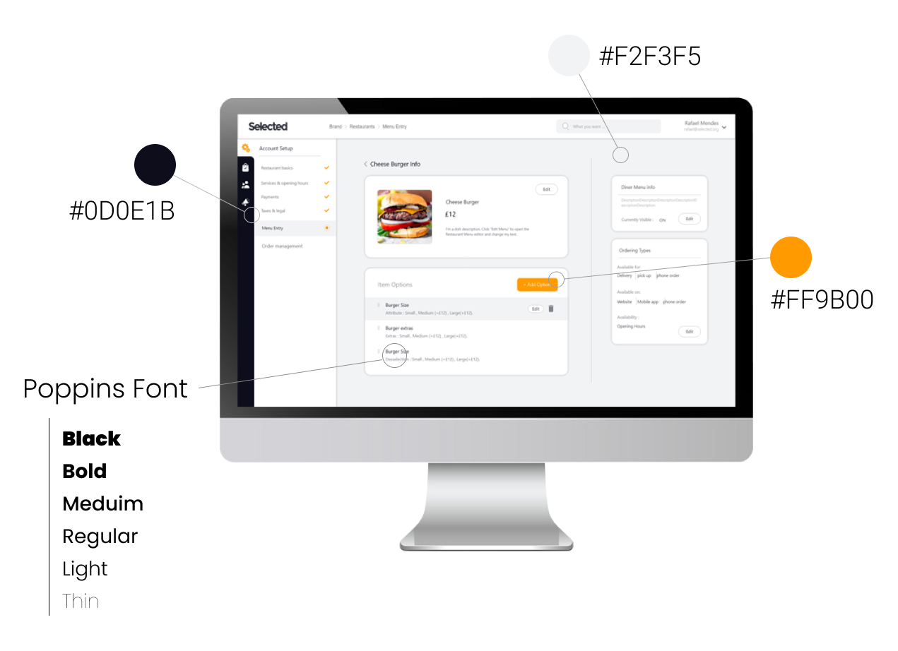
Color Palette & Typography
We introduced a clean, modern UI with a minimalist color scheme to enhance readability and reduce cognitive load.
Primary Colors: Neutral tones for a professional look.
Action Colors: Green for positive actions (confirm), red for errors.
Typography: Sans-serif font for clarity and accessibility.
Usability Testing
Participants: 10 restaurant managers and employees
Method: Moderated usability testing with real-world tasks
Key Metrics: Task completion time, error rate, user satisfaction score
Findings & Iterations
Initial Clicks Reduced by 40%: Simplified workflows led to faster task completion.
Time to Complete Key Tasks Decreased by 35%: Users could complete common actions significantly faster.
User Satisfaction Increased: 80% of participants reported a better experience compared to the previous version.
The redesigned admin panel:
✅ Reduced support and training costs by 50%
✅ Improved task completion speed by 35%
✅ Boosted user satisfaction with an intuitive interface
✅ Minimized errors by implementing guided workflows
Before & After Screenshots (Insert comparison images showcasing improvements in UI and UX.)
User research is crucial, even if indirect. Interviewing the support team provided valuable insights.
Iterative design leads to better outcomes. Testing and refining the design continuously improved the final product.
Simplicity enhances adoption. Reducing complexity led to increased efficiency and user satisfaction.
This project reinforced the importance of user-centered design in enterprise software. By simplifying workflows, reducing friction, and improving usability, we created a product that met both business goals and user needs.
